
Making Things Better By Design
18th June 2015
Arman Nobari, a visual designer working in California, said it best: All things are designed. Just some things more thoughtfully than others.
Compare your average eyesore inner city tower block with the awe-inspiring Art Deco dream that is the Chrysler Building in New York, for instance. Or a boring, boxy saloon with a sleek and sexy Ferrari. Or a Premier League footballer’s gaudy Cheshire mansion with Frank Lloyd Wright’s sublime Fallingwater building in Pennsylvania.
Good, thoughtful design has given us the Eames Chair, the Mini Cooper, the fluted Coca-Cola bottle, the Alessi juicer, the anglepoise lamp, Coco Chanel’s little black dress and the Rolex watch. It’s why we have the Pyramids, Dior handbags, Macintosh computers, the Swiss Army Knife, the Golden Gate Bridge, Lego, the map of the London Underground, the Helvetica font and anything by Jimmy Choo. Good design has also, rather less famously, given us the MemaplexTM safety barrier more of which later.
Bad design, though? It’s been responsible for everything from wasteful food packaging and slum buildings to confusing road signs and the Titanic. Good design, said the late US architect and industrial designer Eliot Noyes: Fulfils its function, respects its materials, is suited to method of production and combines these in imaginative expression. Without careful creative thought, things tend to stop working, fall over, blow up, or sink.
Some problems aren’t always the designer’s fault, mind you. The ‘Walkie Talkie’ in London officially known as 20 Fenchurch Street, and designed by world-renowned architect Rafael Vinoly has been widely and justifiably acclaimed as a landmark building. Unfortunately, last summer was a scorcher, and solar glare reflecting from the Walkie Talkie’s windows was blamed for blistering the paintwork of cars on the street below. (The UK media immediately christened this ‘the death ray’ and, since then, clever sun-shading structures have been installed to stop the problem re-occurring.)
And do you remember when organisers proudly unveiled their freshly minted London 2012 Olympics logo back in 2007? Not everyone was impressed with the design, with some critics noting that, from certain angles, it resembled a toileting monkey or worse. As if that wasn’t bad enough, some internet wags pointed out that, in their opinion, Wenlock and Mandeville, the official London 2012 mascots, looked more like Mikey from Monsters Inc and Sonic the Hedgehog. Which presumably wasn’t the designers’ intended effect.
In the end, the London 2012 logo was broadly (and in some quarters grudgingly) accepted. Which shows that even designs that become wildly, world-beatingly iconic aren’t loved by everyone at the outset. French writer Maupassant hated the Eiffel Tower so much that he had lunch every day in its restaurant the only place in Paris, he said, where he couldn’t see the Eiffel Tower. And, on a smaller, domestic scale, retailers didn’t care for the clear bin on the groundbreaking Dyson DC0I Dual Cyclone bagless vacuum cleaner which launched in 1993 and became a bestseller within 22 months. When its inventor, James Dyson, announced that he wanted his vacuum to have a transparent bin so that the dirt could be seen inside, he was told by all and sundry that it was a terrible idea. Luckily, he didn’t listen to them. We did some market research and everyone we asked hated the thought, remembers Dyson. But we decided to ignore that because we, as engineers, liked seeing the dust. And now, of course, theres hardly a vac
uum cleaner out there that doesnt feature a clear bin. Now James says it and when you start to think about it it makes perfect sense.
Yet not all good design is perfect… and sometimes that’s OK. In fact, tiny flaws can make something that’s already fabulous even more interesting and here we’re mainly thinking about the mole above Cindy Crawford’s upper lip. But in an industrial workplace environment, where human beings are wandering about among heavy machinery, design flaws even small ones are not to be recommended. In fact, in this setting, they can be a disaster waiting to happen.
Take the conventional design of a fixed steel workplace barrier, for instance. Most managers assume that a steel barrier also known generically as an ‘Armco’ barrier is the best way to protect staff in an industrial workplace scenario. Yet while the steel barrier does fulfil one requisite by segregating staff from vehicles, it spectacularly fails in every other regard, because that’s ALL it does. And that is solely down to its design.
If a vehicle hits a steel barrier, the vehicle will be damaged and so will the barrier, which will buckle and need replacing. The floor will also suffer because the force of impact travels downwards, tearing up the concrete; and, even if a full-on collision hasn’t occurred, a scratched barrier will need painting to prevent rust and to maintain high visibility. Quite obviously, no-one had questioned if steel was the best material to use in safety barrier production.
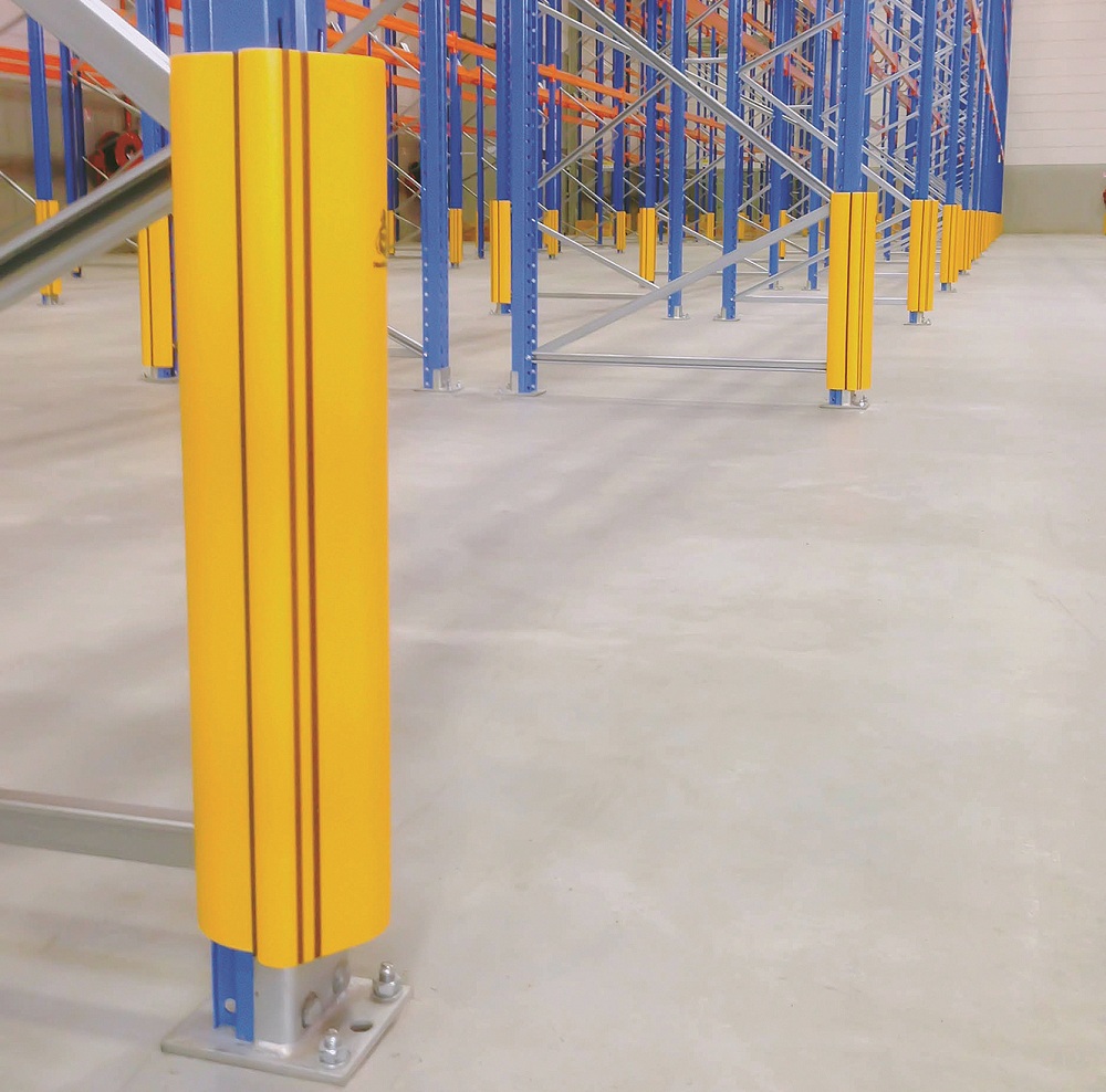
Until a Yorkshire company called A-SAFE came along, that is. A-SAFE recognised the fundamental flaw in the design of industrial workplace barriers and set about creating their own, coming up with a world first in the process. Thinking outside the box and remembering Elliot Noyess maxim about ‘respecting materials’, A-SAFE created their barrier out of MemaplexTM, a material they invented and manufacture themselves. MemaplexTM is a robust and flexible polyolefin blend of eight materials and its molecular structure is re-orientated into a straight line during manufacture, giving it its own built-in memory. Cleverly, that means it doesn’t crumple when hit and it doesn’t dent. Instead, it flexes upon impact and returns to its original shape and, because it’s made from MemaplexTM, it doesn’t corrode and it doesn’t need repainting. It’s also wipe-clean and, because its outer layer is coloured throughout, any scuffs and scratches don’t show. Plus, as MemaplexTM barriers only transfer 20 per cent of the force to thefloor, floor damage isn’t an issue.
But great design isn’t just about how a thing performs or looks. It’s also about easy it is to use. The MemaplexTM barrier is modular with no screws or bolts, so it’s simple to put together and disassemble. Again, with their creative hats on, the people at A-SAFE have given some of their products moving parts, such as optional spinning collars, which help to deflect impacts; and they designed their base plates with countersunk fixings so a vehicle won’t be damaged if it gets too close to the base of the barrier.
The result of all this innovation is a range of pedestrian guardrails and vehicle check systems, including bollards and stack protection buffers, all tested and certified to British Standards that’s a great example of revolutionary invention and pioneering design. So why aren’t these products more famous? Well, to the many big blue chip companies who use A-SAFE’s safety barriers behind-their-scenes in loading bays and warehouses, for example they absolutely are. And famously effective, too.
There’s one other thing about good design: it evolves and improves over time. Think about how Aston Martin models have changed over the years. A-SAFEs creatives know that too and are always looking to improve the design of their products. Good design is about never being satisfied, never being complacent and always being open to more and more innovation. It’s about being on a permanent quest for creative and practical perfection.
And, here, designer Brittany Grabowski has a point: After finishing a design you take a step back and a little voice pops in your head and says: ‘Wow. You should really just quit while youre ahead. Dont ever listen to that voice. Ever.